
How to create a donation page on a nonprofit website
Most nonprofits think a donation page is simple:
Add a form
Add a button
Call it a day
But if your donation page isn’t converting, the issue isn’t your mission. It’s the structure.
A donation page is not a checkout screen. It is the final step in an emotional journey.
If it isn’t intentionally designed, you will quietly lose donations — even from people who deeply care about your cause.
This guide walks you step-by-step through how to create a donation page that builds trust, increases recurring giving, and supports long-term sustainability.
Before You Start: THIS IS The Purpose of a Donation Page
A high-performing donation page does five things:
Clarifies impact immediately
Reduces hesitation
Builds trust
Makes giving feel meaningful
Removes friction
If your page only contains a form, you don’t have a donation page. You have a transaction screen.
Let’s fix that.
Step 1: Capture Attention in 8 Seconds
When someone lands on your donation page, they are subconsciously asking:
What am I supporting?
Who does this help?
Why does this matter right now?
Your headline must answer these immediately.
❌ Weak Headline Example:
“Support Our Organization”
✅ Strong Headline Example:
“Help Provide Trauma-Informed Mental Health Care to Young Adults Who Cannot Afford It”
Notice the difference:
Specific > General
Human > Abstract
Outcome > Organization
Visual Layout Example:
Hero Image Showing Real People or Program Impact
Bold Headline
1–2 sentence emotional support statement
Primary Donate Button
Your hero section (the first section at the top of your page) should make someone feel something before they scroll.
Step 2: Lead With Monthly Giving
Recurring donations create sustainability for your organization and confidence for your donor.
Instead of hiding the monthly option, position it first.
Why?
Monthly giving:
Increases donor lifetime value
Improves financial stability
Creates emotional commitment
Visual Example:
If possible, create a pre-selected Toggle Button:
◉ Monthly Giving
○ One-Time Gift
Below that, show impact tiers:
$25/month funds one peer support session
$50/month sponsors counseling access
$100/month supports outreach in underserved communities
The clearer the outcome, the higher the conversion.
People don’t give to “operational support.” They give to transformation. Quantify how each donation amount will support the humans you serve.
Step 3: Show Exactly Where the Money Goes
Transparency increases trust.
After the giving form, include a section titled:
“How Your Donation Is Used”
Break it down clearly:
65% Direct Programs
20% Staff & Care Teams
10% Outreach & Education
5% Technology & Accessibility
Or break it down by donation tier:
$50 = Supplies for one participant
$150 = One therapy session
$500 = Full month of group programming
Visual Layout Example:
Three or four simple icons with short impact descriptions underneath. Keep it clean. Keep it specific.
Step 4: Add Social Proof and Impact Stories
Before someone gives, they want reassurance.
This is where testimonials and impact stories matter.
Include:
Short quotes from beneficiaries
A photo + one sentence story
A statistic that demonstrates results
A short case study
Example:
“Because of this program, I finally felt understood.” – Program Participant
Or use a statistic:
87% of participants reported improved well-being within 90 days.
Social proof reduces doubt and increases emotional confidence.
Step 5: Repeat the Donation Form
Never make someone scroll back up to give.
If someone reads your impact section and feels ready, the form should be right there.
Your Donation Form Should Include:
Monthly / One-time toggle
Pre-set amounts (3–5 options)
Custom amount option
Simple payment fields
Clear CTA button
Good CTA Examples:
“Fund a Session”
“Support a Young Adult Today”
“Make an Impact Now”
Avoid generic phrases like “Submit.”
Step 6: Add a Transparency & Accountability Statement
Many donors hesitate because they worry about how funds are managed.
Include a short statement such as:
“We are committed to thoughtful stewardship of every dollar. Donors receive quarterly impact updates and our annual report is publicly available.”
You can also link to:
Your annual report (open in new tab)
Financial summary
990 form
Transparency builds long-term trust.
Step 7: Close With Gratitude
End your page with appreciation. Gratitude activates generosity.
Example:
“Thank you for believing in young adults who deserve care, dignity, and support. Your generosity fuels real change.”
Even before they click donate, they should feel seen and valued.
Recommended Donation Page Structure
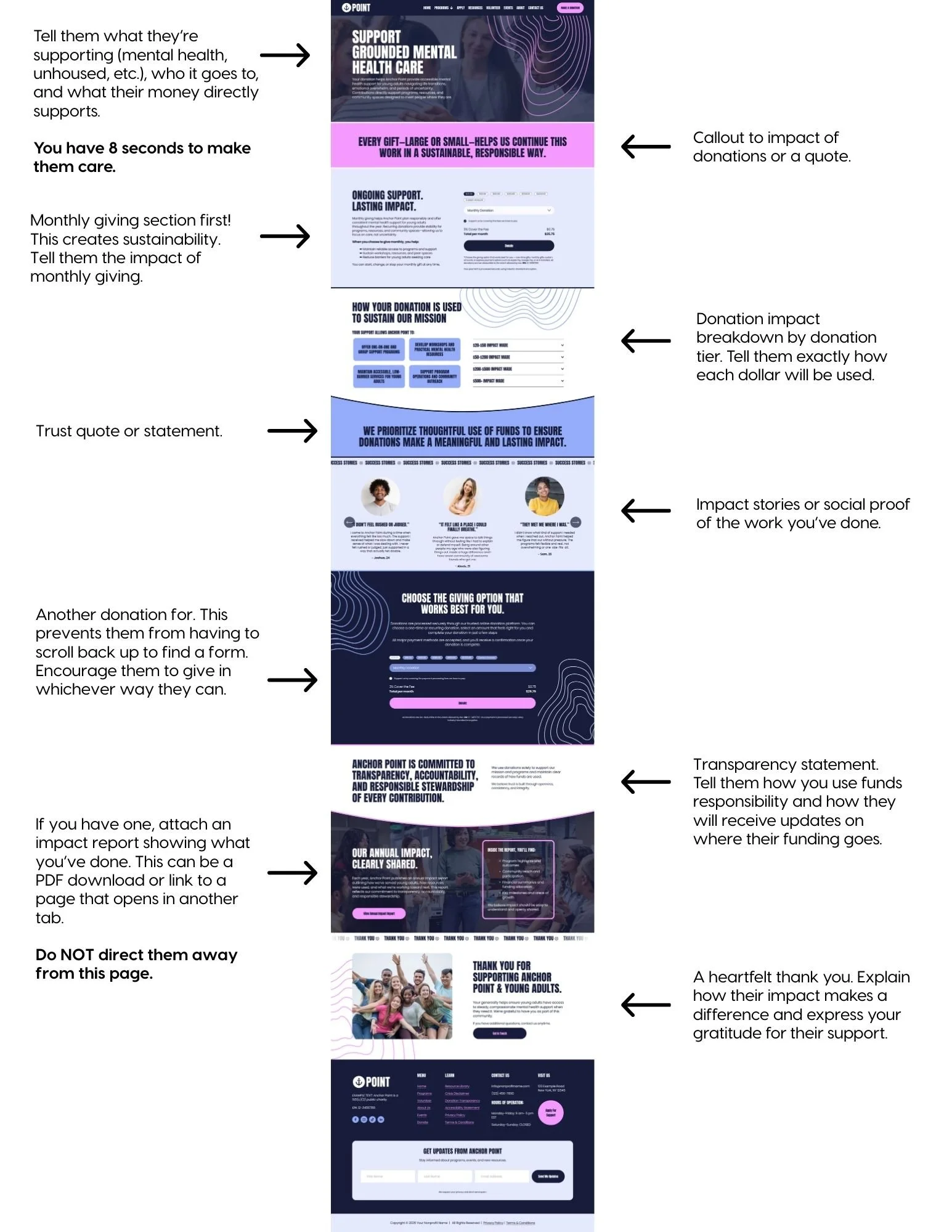
Here is the ideal layout flow of your donation page:
Hero section (clear impact headline)
Primary donation form (monthly first)
Impact breakdown
Testimonials or success stories
Secondary donation form
Transparency statement
Gratitude closing
Simple. Clear. Intentional.
Common Donation Page Mistakes to Avoid
Vague headlines
No emotional storytelling
No explanation of impact
Only one donation form at the top
Complicated checkout process
No mobile optimization
No trust indicators
Remember: Donation is a feeling, not a function.
If your page doesn’t build emotion and clarity before asking for money, you are relying on hope instead of strategy.
Recommended Donation Platform: Zeffy (100% Free for Nonprofits)
If you’re looking for a donation processor that protects your budget and keeps more money in your mission, Zeffy is one of the strongest options available for small to mid-sized nonprofits.
Unlike traditional processors that take 2–4% per donation, Zeffy does not charge transaction fees to nonprofits.
Yes, zero platform fees. Instead, donors are given the option to leave a voluntary tip to support Zeffy’s software.
That means:
More of every dollar goes directly to your programs.
Why Zeffy Is a Strong Option for Nonprofits
1. No Transaction Fees
Most processors charge:
2.2%–2.9% + $0.30 per transaction
Monthly platform fees
Add-on fees for recurring gifts
With Zeffy:
100% of the donation goes to your nonprofit
No hidden processing fees
No monthly subscription costs
For growing nonprofits, this can save thousands per year.
2. Built Specifically for Nonprofits
Zeffy is not a general e-commerce tool repurposed for charities.
It’s specifically designed for:
Donations
Recurring giving
Event ticketing
Peer-to-peer fundraising
Raffles and campaigns
That focus matters. The tools are structured around nonprofit workflows — not online shopping carts.
3. Simple, Clean Donation Forms
You can create:
One-time + monthly donation toggles
Custom donation amounts
Campaign-specific forms
Branded pages
Embedded forms for your website
This makes it easy to integrate into:
Squarespace
Wix
WordPress
Custom-built sites
You can embed the form directly on your donation page so donors never leave your website.
4. Built-In Recurring Donation Tools
Monthly giving is essential for sustainability.
Zeffy allows you to:
Set up recurring donation options
Automatically process monthly gifts
Track donor history
Export donor data
Recurring donors dramatically increase lifetime value and financial stability.
5. Easy Donor Management
Inside your dashboard, you can:
View donor records
Export CSV files
Track campaigns
Monitor recurring donations
Send confirmation emails
You maintain ownership of your donor data.
How to Get Started with Zeffy
Here’s a simple step-by-step process:
Step 1: Create a Free Account
Go to zeffy.com and create your nonprofit account.
You’ll need:
Organization name
EIN
Bank account information
Basic nonprofit details
Approval is typically quick.
Step 2: Connect Your Bank Account
This allows donations to be deposited directly into your organization’s account.
Make sure:
The bank account belongs to your nonprofit
Admin access is under your organization’s email
Ownership matters.
Step 3: Create Your Donation Form
Inside the dashboard:
Select “Create a Campaign”
Choose donation type (one-time + recurring)
Customize amounts
Add impact descriptions
Upload logo and brand colors
Tip: Use language that reflects outcomes, not general operating costs.
Example: Instead of “General Fund” use “Provide 1 Counseling Session”
Step 4: Embed on Your Website
Zeffy provides:
A direct donation page link
An embed code
For best results: Embed the form directly on your donation page instead of sending donors off-site.
Reducing friction increases conversions.
Step 5: Test Everything
Before going live:
Make a small test donation ($5.00 is perfect)
Confirm recurring option works
Verify confirmation emails
Check mobile responsiveness
Confirm funds deposit correctly
Never assume. Always test!
Who Zeffy Is Best For
Zeffy is ideal for:
Small to mid-sized nonprofits
Organizations wanting zero transaction fees
Teams without technical staff
Groups prioritizing recurring giving
If your organization requires complex enterprise-level integrations, you may eventually need additional systems — but for most community-based nonprofits, Zeffy is more than sufficient.
Final Recommendation
Your donation processor should:
Protect your revenue
Be simple to manage
Keep ownership under your nonprofit
Integrate cleanly with your website
Support recurring giving
Zeffy checks all of those boxes.
When combined with a strategically structured donation page, it becomes a powerful tool for sustainability — not just transactions.
Because your mission deserves to keep as much of every dollar as possible.
Final Thought: Your Donation Page Is a Relationship Starter
Your donation page is not just about today’s gift.
It is about:
Future recurring donors
Long-term supporters
Email list growth
Donor retention
Community trust
When structured properly, your donation page becomes:
A trust-building tool
A storytelling platform
A sustainability engine
Not just a form.